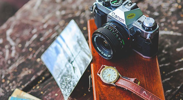
Few sensory experiences can evoke an emotion as effectively as seeing a striking visual image.
Marketers use images to form emotional connections with people, to make them feel comfortable or uncomfortable as the need may be. Magazines are filled with images that are carefully and deliberately lit, staged and selected to make the viewer feel an intended emotion.
Websites are not immune to the power of photography, and the best websites clearly recognize the importance of good imagery.
When a website is out of style and ready for an overhaul, too often photography is forgotten and pushed out of the way by other considerations.
It’s worth taking the time to consider that your customers will appreciate good imagery.
Style and substance are not mutually exclusive, and so for that reason when you’re considering a new website, you don’t have to go high-end, a great place to start is by looking at some stock photography websites.
Finding good photographs
Even if you are working in a highly specialized business, from car parts to dentures, there is a stock photograph available to you. Among the most popular of the paid image websites are Shutterstock and iStock Photo. They occasionally have promotions, but their terms range from per-image rates to an array of package deals.
If you have the patience to curate some images yourself, you can use Google to search up the object you are looking for and use the Image Search tool’s “Usage rights” filter to only show pictures that are “Labelled for reuse”, or at least reuse with some modification. many people make their photographs freely usable.
However, if you are looking for a picture of that very specialized thing that is your area of expertise, your stock image might just be in your pocket … with the camera that everyone seems to carry around with them.
Creating your own
Using your phone’s camera and running it through an Instagram filter can be surprisingly effective. Even with basic image editing software, it is possible to alter colours in a way that could improve an otherwise average looking picture.
Also, the power of a genuine image from a real person can not be overstated, especially when being mindful of the importance of forming that emotional connection.
Other apps like Pixlr can be helpful when editing images. There are effects, filters, layers, frames to frame multiple images in a mosaic and it even offers options for image size and dimension when you’re saving images to your camera roll.
Numbers and pictures
If you’re placing your image into a webpage as a background image, it is best to consider the size. It’s not just the file’s number of KB, but the image’s pixel dimensions are a big factor on the time it takes for your browser to fully load your background picture. The largest image on the page shouldn’t be any larger than 150KB.
After your image has been aligned, cropped and colour corrected, make sure a full width background image is at least wide enough to span the average person’s computer browser window “viewport” width. The width of the average screen may be wider than 1200 – 1600 pixels but that is all the width you would need to use as a backdrop.
One last consideration for website photography
These days, having a person wait fifteen seconds for a webpage to load is a lot to ask. Just imagine that person is standing next to their friend trying to tell them about your business.
Keep images to the point, so no bigger than they have to be – you may wish to consult with your web designer for mobile, as there are tricks to serving big images, or omitting them for smartphones, which are usually on slower connections than big desktop computers.
People may love photography, but waiting … not so much.


